Squarespace Cover Page Layout Comparison – Media Templates
Compare the features of all the fancy Cover Page layouts
This is my analysis and comparison of the features of all the Squarespace Cover Page “media” layouts*. A media layout is my name for the Cover Page layouts that have a media element associated with them, for example, audio, video, Twitter or map – in other words, everything that isn’t a basic layout.
A basic layout is any Cover Page that only allows you to have text + image content, plus optional logo (no videos or anything fancy). I have also made a comparison page for all of the basic Squarespace Cover Page layouts… and in fact, you may want to start there, because this page refers to the basic layouts, since all of the media layouts are based on a basic one.
* When it comes to Squarespace Cover Pages, the word “layout “is really the same thing as “template”, just for Cover Pages. I think Squarespace have called them layouts to avoid confusion with full site templates. View my Squarespace template comparison chart if your Squarespace website will have more than just a Cover Page.
If you don’t know what a Cover Page is and how it’s different from a normal Squarespace website, here’s my blog post explaining what Cover Pages are and ideas for how to use them. You may also want to check out my blog post on the different Squarespace subscription plans and how to choose the right one.
Audio Cover Page layouts:

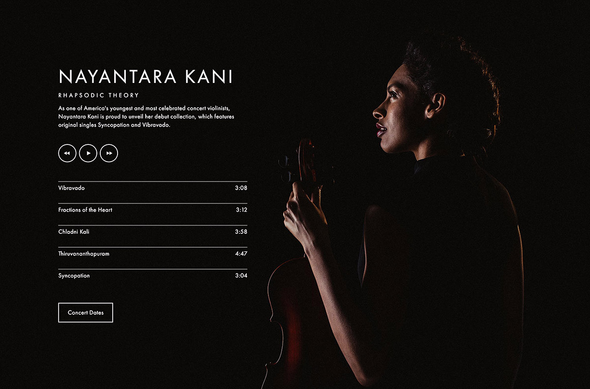


| Layout name: | Tour | Record | Session | Broadcast |
|---|---|---|---|---|
| Squarespace category: | Audio | Audio | Audio | Audio |
| Layout notes: | This is the Trade layout with audio | This is the Vanguard / Silhouette layout with audio | This is the Vignette layout with audio | This is the Cover / Jacket / Reveal layout with audio |
| Layout format: | Fullscreen background image(s) with floating content | Fullscreen background image(s) with floating content | Splitscreen vertically into 2 columns: half is the image(s), the other half has content | Fullscreen background image(s) with floating content |
| Branding (logo or text): | Top left | Middle of page, just above text content | Below audio | Top of page |
| Text content: Headline | Middle of page | Middle of page, just below branding | Below branding | Below audio |
| Text content: Body | Below headline | Below headline | Below headline | Below headline |
| Buttons / Nav: | Top right, far right | Below audio tracks, left of social (if buttons & social can both fit on one row) | Below body, left of social (if buttons & social can both fit on one row) | Below text content |
| Social icons: | Top right, to the left of buttons/nav | Right of or below buttons, depending on whether they can fit on the same row | Right of or below buttons, depending on whether they can fit on the same row | Bottom of page |
| Media element: | Bottom, stretching full width of the screen, with control buttons top left | Control buttons below body. Audio tracks below controls, and above buttons & social. | Control buttons sit above everything in the content column, with audio tracks below controls and above branding. | Audio sits in middle of page. Control buttons sit above the audio tracks. |
| Media element notes: | Can control size, shape and color of audio controls. Can set font and color of track listing. | Can control size, shape and color of audio controls. Can set font and color of track listing. | Can control size, shape and color of audio controls. Can set font and color of track listing. | Can control size, shape and color of audio controls. Can set font and color of track listing. |
| Alignment of content: | Only affects text content and audio; branding, social and buttons are set. Can set left, right, centre - this moves the text content on the page and also sets the text alignment. | Left, right, centre of page | Content column can be on the left or the right of the image column | Left, right, centre of page |
| Text alignment: | Controlled by content positioning. | Left, right, centre of content area | Left, right, centre of column | Left, right, centre of content area |
| Imagery: | Fullscreen static image or slides of multiple images | Fullscreen static image or slides of multiple images | Tall vertical static image or slides of multiple images. | Fullscreen static image or slides of multiple images |
| Image notes: | If no images, then can use solid background color for the whole screen. | If no images, then can use solid background color for the whole screen. | If no images, then can use solid background color for the image column | If no images, then can use solid background color for the whole screen. |
| Style notes: | Text colors & styles, page border style, overlay tint on photo, loading color (seen as background before page loads). | Text colors & styles, page border style, overlay tint on photo, loading color (seen as background before page loads). | Text colors & styles, page border style, color of content column, overlay tint on photo, background color. | Text colors & styles, page border style, overlay tint on photo, loading color (seen as background before page loads). |
Video Cover Page layouts:


| Layout name: | Premier | Debut | Projector |
|---|---|---|---|
| Squarespace category: | Video | Video | Video |
| Layout notes: | This is the Trade layout with video | This is basically the Portrait / Snapshot layout with video, except the headline sits with the body text. | This is the Portrait / Snapshot layout with video. |
| Layout format: | Fullscreen background image(s) with floating content | Fullscreen background image(s) with floating content | Fullscreen background image(s) with floating content |
| Branding (logo or text): | Top left | Far left | Far left |
| Text content: Headline | Middle of page | Left, sitting just to the right of the branding | Far left, sitting just below branding |
| Text content: Body | Below headline | Left, sitting just below headline | Left, sitting just to the right of the branding |
| Buttons / Nav: | Top right, far right | Far right | Far right |
| Social icons: | Top right, to the left of buttons/nav | Right, sitting just to the left of the buttons/nav | Right, sitting just to the left of the buttons/nav |
| Media element: | Video controls sit below body text. | Video controls sit at bottom if content is set to top or middle. Video controls move to top if content is set to bottom. | Video controls sit in middle centre of the page. |
| Media element notes: | Can control size, shape and color of video controls. | Can control size, shape and color of video controls. | Can control size, shape and color of video controls. |
| Alignment of content: | Only affects text content and video controls; branding, social and buttons are set. Can set left, right, centre - this moves the text content on the page and also sets the text alignment. | Top, middle or bottom of the page | Top or bottom of the page |
| Text alignment: | Controlled by content positioning. | None - branding and text content are always left-aligned, and buttons/social are always right-aligned. | None - branding and text content are always left-aligned, and buttons/social are always right-aligned. |
| Imagery: | Fullscreen static image or slides of multiple images. TIP: Use still(s) from your video. | Fullscreen static image or slides of multiple images. TIP: Use still(s) from your video. | Fullscreen static image or slides of multiple images. TIP: Use still(s) from your video. |
| Image notes: | If no images, then can use solid background color for the whole screen. | If no images, then can use solid background color for the whole screen. | If no images, then can use solid background color for the whole screen. |
| Style notes: | Text colors & styles, page border style, overlay tint on photo, loading color (seen as background before page loads). | Text colors & styles, page border style, overlay tint on photo, loading color (seen as background before page loads). | Text colors & styles, page border style, overlay tint on photo, loading color (seen as background before page loads). |
Map and Twitter Cover Page layouts:


| Layout name: | Flagship | Harbor | Status | Echo |
|---|---|---|---|---|
| Squarespace category: | Location | Location | ||
| Layout notes: | This is very similar to Flash / Spotlight and Vignette, with a map instead of image(s) column. | This is very similar to Portrait / Snapshot layout with a map instead of image(s). | This is the Trade layout, with Twitter instead of text content. | This is basically a reverse version of the Status layout. |
| Layout format: | Splitscreen vertically into 2 columns: half is the image(s), the other half has content | Fullscreen map with floating content | Fullscreen background image(s) with floating content | Fullscreen background image(s) with floating content |
| Branding (logo or text): | Middle of content column | Far left | Top left | Bottom right |
| Text content: Headline | Below branding | Far left, below branding | NONE | NONE |
| Text content: Body | Below headline | Far left, below headline | NONE | NONE |
| Buttons / Nav: | Bottom of content column, left of social (if buttons & social can both fit on one row) | Far right | Top right, far right | Bottom left, far left |
| Social icons: | Bottom of content column, right of or below buttons, depending on whether they can fit on the same row | Right, sitting just to the left of the buttons/nav | Top right, to the left of buttons/nav | Bottom left, to the right of buttons/nav |
| Media element: | Map fills the column where the image(s) would be. Clicking on map pin opens Google Map in new window. | Fullscreen map where the image(s) would be. Clicking on map pin opens Google Map in new window. | Tweets & date show in middle of page. Can set to show up to 20 tweets in a rotating fade “slideshow”. | Tweets & date show in middle of page. Can set to show up to 20 tweets in a rotating fade “slideshow”. |
| Media element notes: | Can choose map style to be minimal dark, light or pale blue. minimal style shows no words on map. | Can choose map style to be minimal dark, light or pale blue. minimal style shows no words on map. | Can show avatar and/or display name. Can control fonts and colors for all Twitter elements. | Can show avatar and/or display name. Can control fonts and colors for all Twitter elements. |
| Alignment of content: | Content column can be on the left or the right of the image column | Top, middle or bottom of the page | Only affects Twitter content; branding, social and buttons are set. Can set left, right, centre - this moves the Twitter content on the page and also sets the Twitter text alignment. | Only affects Twitter content; branding, social and buttons are set. Can set left, right, centre - this moves the Twitter content on the page and also sets the Twitter text alignment. |
| Text alignment: | Left, right, centre of column | None - branding and text content are always left-aligned, and buttons/social are always right-aligned. | Controlled by content positioning. | Controlled by content positioning. |
| Imagery: | NONE | NONE | Fullscreen static image or slides of multiple images | Fullscreen static image or slides of multiple images |
| Image notes: | N/A | N/A | If no images, then can use solid background color for the whole screen. | If no images, then can use solid background color for the whole screen. |
| Style notes: | Text colors & styles, page border style, color of content column. | Text colors & styles, page border style, color of content column. | Text colors & styles, page border style, overlay tint on photo, loading color (seen as background before page loads). | Text colors & styles, page border style, overlay tint on photo, loading color (seen as background before page loads). |
If you haven’t already, then you should probably check out:
P.S. Please excuse the occasional switching from US to UK spelling… my computer is in the UK (as am I) but I’m American, so sometimes it gets confusing!