Squarespace Cover Page Layout Comparison - Basic Templates
Compare the features of all the basic Cover Page layouts
This is my analysis and comparison of the features of all the basic Squarespace Cover Page layouts*. A basic layout is any Cover Page that only allows you to have text + image content, plus optional logo (no videos or anything fancy).
I have also made a comparison page for all of the “media” layouts. A media layout is my name for the Cover Page layouts that have a media element associated with them, for example, audio, video, Twitter or map – in other words, everything that isn’t a basic layout. View my Cover Page media layout comparison page >
Although officially there are 28 Cover Page layouts, this is a bit misleading, because many of the layouts are identical or nearly identical to others. By my count, there are 11 true basic layouts, which are detailed below in a handy comparison chart so you can see the differences between them. All of the media layouts are based on one of the basic layouts here.
Basic layouts encompass both Landing and Profile categories. Category refers to the drop-down menu you use within the Squarespace interface to select your layout. The only difference between Landing and Profile is that on a Landing layout, the headline is grouped with the body text, whereas on a Profile layout, the headline is grouped with the branding element (site title or logo). Since they are so similar, I consider them really just variations of basic layouts.
* When it comes to Squarespace Cover Pages, the word “layout “is really the same thing as “template”, just for Cover Pages. I think Squarespace have called them layouts to avoid confusion with full site templates. View my Squarespace template comparison chart if your Squarespace website will have more than just a Cover Page.
If you don’t know what a Cover Page is and how it’s different from a normal Squarespace website, here’s my blog post explaining what Cover Pages are and ideas for how to use them. You may also want to check out my blog post on the different Squarespace subscription plans and how to choose the right one.
Basic Cover Page layouts with main content in the middle:
Middle as in top to bottom, not left to right. You can adjust the content to be on the left, right or centre of the page on all of these.


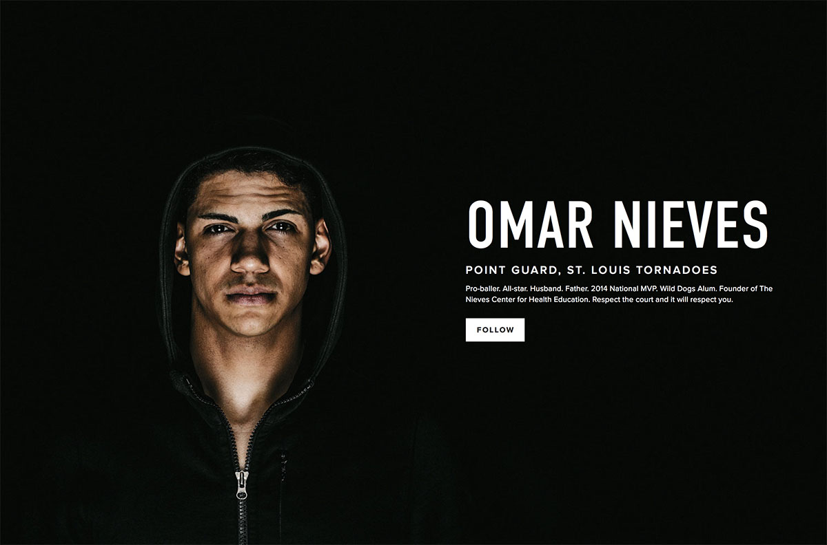

| Layout name: | Cover / Jacket / Reveal | Gazette | Silhouette / Vanguard | Card |
|---|---|---|---|---|
| Squarespace category: | Landing | Landing | Profile | Landing |
| Layout notes: | Cover / Jacket / Reveal have identical layouts and controls | Choose Cover / Jacket / Reveal if you want the buttons/nav to sit closer to the body text. | Silhouette and Vanguard have identical layouts and controls | The only layout with a “card” - a floating solid background behind the content area |
| Layout format: | Fullscreen background image(s) with floating content | Fullscreen background image(s) with floating content | Fullscreen background image(s) with floating content | Fullscreen background image(s) with content on an opaque rectangle “card” in the middle |
| Branding (logo or text): | Top of page | Middle of page, just above text content | Middle of page, just above text content | Top of the card |
| Text content: Headline | Middle of page | Middle of page, just below branding | Middle of page, just below branding | Below branding on the card |
| Text content: Body | Below headline | Below headline | Below headline | Below headline |
| Buttons / Nav: | Below text content | Bottom of page, just above social icons | Below body, left of social (if buttons & social can both fit on one row) | Below text content |
| Social icons: | Bottom of page | Bottom of page, just below buttons/nav | Right of or below buttons, depending on whether they can fit on the same row | Bottom of page |
| Alignment of content: | Left, right, centre of page | Left, right, centre of page | Left, right, centre of page | Left, right, centre of page |
| Text alignment: | Left, right, centre of content area | Left, right, centre of content area | Left, right, centre of content area | Left, right, centre of content area |
| Imagery: | Fullscreen static image or slides of multiple images | Fullscreen static image or slides of multiple images | Fullscreen static image or slides of multiple images | Fullscreen static image or slides of multiple images |
| Image notes: | If no images, then can use solid background color for the whole screen. | If no images, then can use solid background color for the whole screen. | If no images, then can use solid background color for the whole screen. | If no images, then can use solid background color for the whole screen. |
| Style notes: | Text colors & styles, page border style, overlay tint on photo, loading color (seen as background before page loads). | Text colors & styles, page border style, overlay tint on photo, loading color (seen as background before page loads). | Text colors & styles, page border style, overlay tint on photo, loading color (seen as background before page loads). | Text colors & styles, page border style, color of card, overlay tint on photo, loading color (seen as background before page loads). |
| Similar to: | Gazette | Cover / Jacket / Reveal | Card | Silhouette / Vanguard |
Basic Cover Page layouts with elements in the corners:


| Layout name: | Trade | Mission | Portrait / Snapshot |
|---|---|---|---|
| Squarespace category: | Landing | Landing | Profile |
| Layout notes: | Choose Card or Cover / Jacket / Reveal if you want the button to sit closer to the body text. | Choose Portrait / Snapshot if you want the headline to sit with the branding, and buttons to be separated away from content. | Portrait and Snapshot have identical layouts and controls. Choose Mission if you want the headline to sit with the body text & buttons. |
| Layout format: | Fullscreen background image(s) with floating content | Fullscreen background image(s) with floating content | Fullscreen background image(s) with floating content |
| Branding (logo or text): | Top left | Bottom of page if text content is top or middle / Top of page if text content is bottom | Far left |
| Text content: Headline | Middle of page | Top or middle of page if branding is bottom / Bottom of page if text is top | Far left, just below branding |
| Text content: Body | Below headline | Below headline | Left, sitting just to the right of the branding/headline |
| Buttons / Nav: | Top right, far right | Below text content, left (next to social icons) | Far right |
| Social icons: | Top right, to the left of buttons/nav | Below text content, right (next to buttons/nav) | Right, sitting just to the left of the buttons/nav |
| Alignment of content: | Only affects text content; branding, social and buttons are set. Can set left, right, centre - this moves the text content on the page and also sets the text alignment. | Can choose top or middle or bottom placement for text content (this will move the branding, too) | Top, middle or bottom of the page |
| Text alignment: | Controlled by content positioning. | Left, right, centre of content area | None - branding and text content are always left-aligned, and buttons/social are always right-aligned. |
| Imagery: | Fullscreen static image or slides of multiple images | Fullscreen static image or slides of multiple images | Fullscreen static image or slides of multiple images |
| Image notes: | If no images, then can use solid background color for the whole screen. | If no images, then can use solid background color for the whole screen. | If no images, then can use solid background color for the whole screen. |
| Style notes: | Text colors & styles, page border style, overlay tint on photo, loading color (seen as background before page loads). | Text colors & styles, page border style, overlay tint on photo, loading color (seen as background before page loads). | Text colors & styles, page border style, overlay tint on photo, loading color (seen as background before page loads). |
| Similar to: | Card, Cover/Jacket/Reveal | Portrait / Snapshot | Mission |
Basic Cover Page layouts with large solid color block elements:


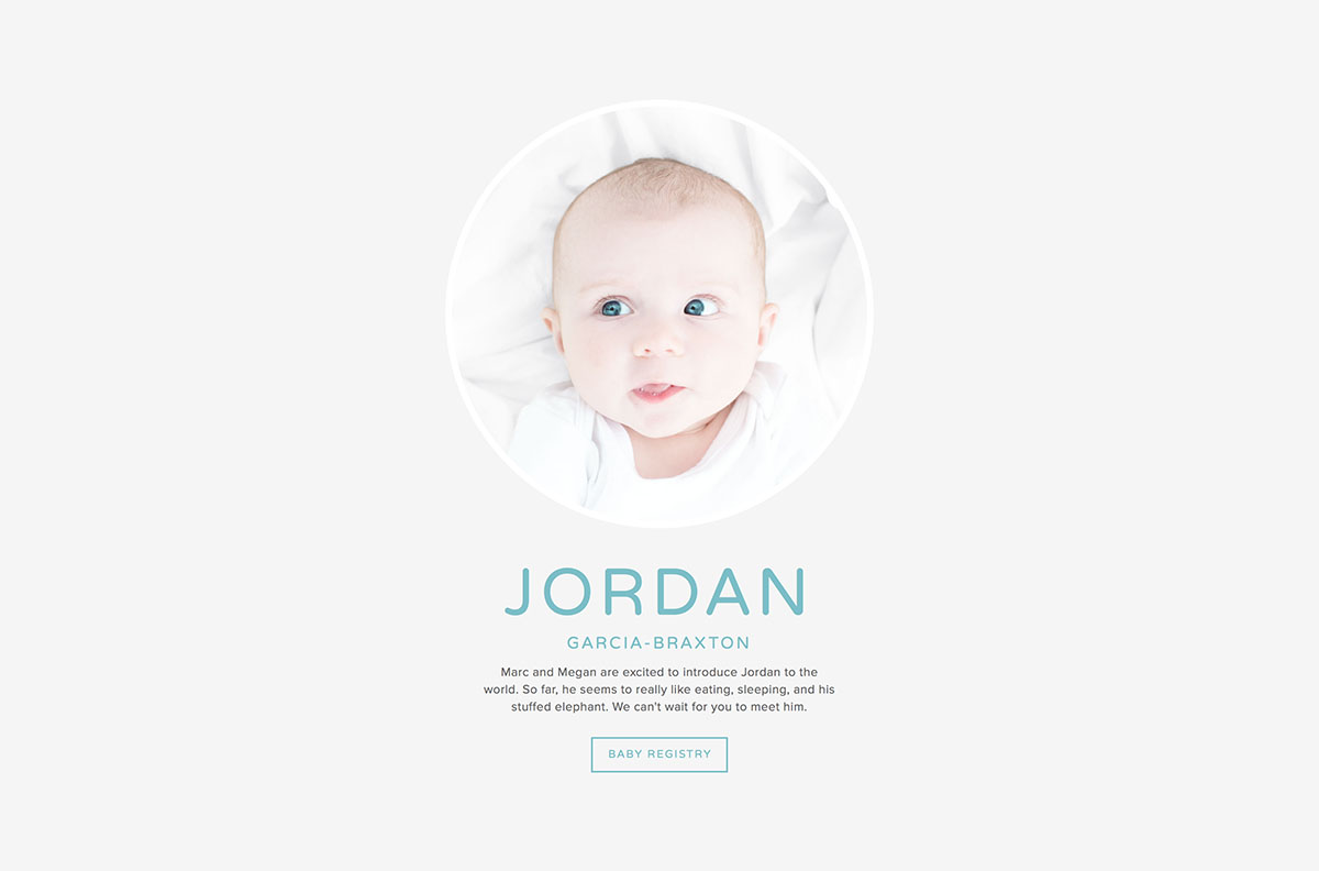
| Layout name: | Flash / Spotlight | Vignette | Backstory | Focus / Monocle |
|---|---|---|---|---|
| Squarespace category: | Landing | Profile | Profile | Profile |
| Layout notes: | Choose Gazette if you don’t want a solid background content column, and want the content to float on the page. | Choose Backstory if you have longform text. Choose Flash / Spotlight if you want to separate branding (and social) from the body content. | Choose Vignette if you want to keep the image clean. Choose Flash / Spotlight if you want to separate branding (and social) from the body content. Best layout to choose if you have long body text. | Focus and Monocle have identical layouts and controls |
| Layout format: | Splitscreen vertically into 2 columns: half is the image(s), the other half has content | Splitscreen vertically into 2 columns: half is the image(s), the other half has content | Splitscreen vertically into 2 columns: half is the image(s) with floating elements, the other half has body text on opaque background | Solid color background with floating content and circular image(s) in the centre of the page. |
| Branding (logo or text): | Top of content column | Middle of content column | Top, floating on image | Below image circle |
| Text content: Headline | Middle of content column | Below branding | Below branding | Below branding |
| Text content: Body | Below headline | Below headline | Sitting on its own in the solid coloured column. | Below headline |
| Buttons / Nav: | Below text content | Below body, left of social (if buttons & social can both fit on one row) | Bottom, floating on image. Sits on the left of social (if buttons & social can both fit on one row) | Below body, left of social (if buttons & social can both fit on one row) |
| Social icons: | Bottom of content column | Right of or below buttons, depending on whether they can fit on the same row | Right of or below buttons, depending on whether they can fit on the same row | Right of or below buttons, depending on whether they can fit on the same row |
| Alignment of content: | Content column can be on the left or the right of the image column | Content column can be on the left or the right of the image column | Content column can be on the left or the right of the image column | None - all content always stays in a narrow column in the centre of the page. |
| Text alignment: | Left, right, centre of content column | Left, right, centre of content column | Left, right, centre in the image column | Left, right, centre within the content area |
| Imagery: | Tall vertical static image or slides of multiple images. | Tall vertical static image or slides of multiple images. | Tall vertical static image or slides of multiple images. | Image shows in a circle, so best for square images |
| Image notes: | If no images, then can use solid background color for the image column | If no images, then can use solid background color for the image column | If no images, then can use a background color. Can control background behind body text independently of this. | Can control size of image circle, and can set and control a border to show around the circle image. |
| Style notes: | Text colors & styles, page border style, color of content column, overlay tint on photo, loading color (seen as background before page loads). | Text colors & styles, page border style, color of content column, overlay tint on photo, background color. | Text colors & styles, page border style, color of content column, overlay tint on photo, background color. | Text colors & styles, page border style, circle image border, overlay tint on photo, background color. |
| Similar to: | Vignette, Backstory | Backstory, Flash / Spotlight | Vignette, Flash / Spotlight | NONE |
Now check out:
P.S. Please excuse the occasional switching from US to UK spelling… my computer is in the UK (as am I) but I’m American, so sometimes it gets confusing!