Pacific Squarespace Template Analysis
Helpful notes on the distinctive features of the Pacific family of templates
Updated March 2018
Template Name: Pacific family
Includes: Charlotte, Fulton, Horizon, and Naomi
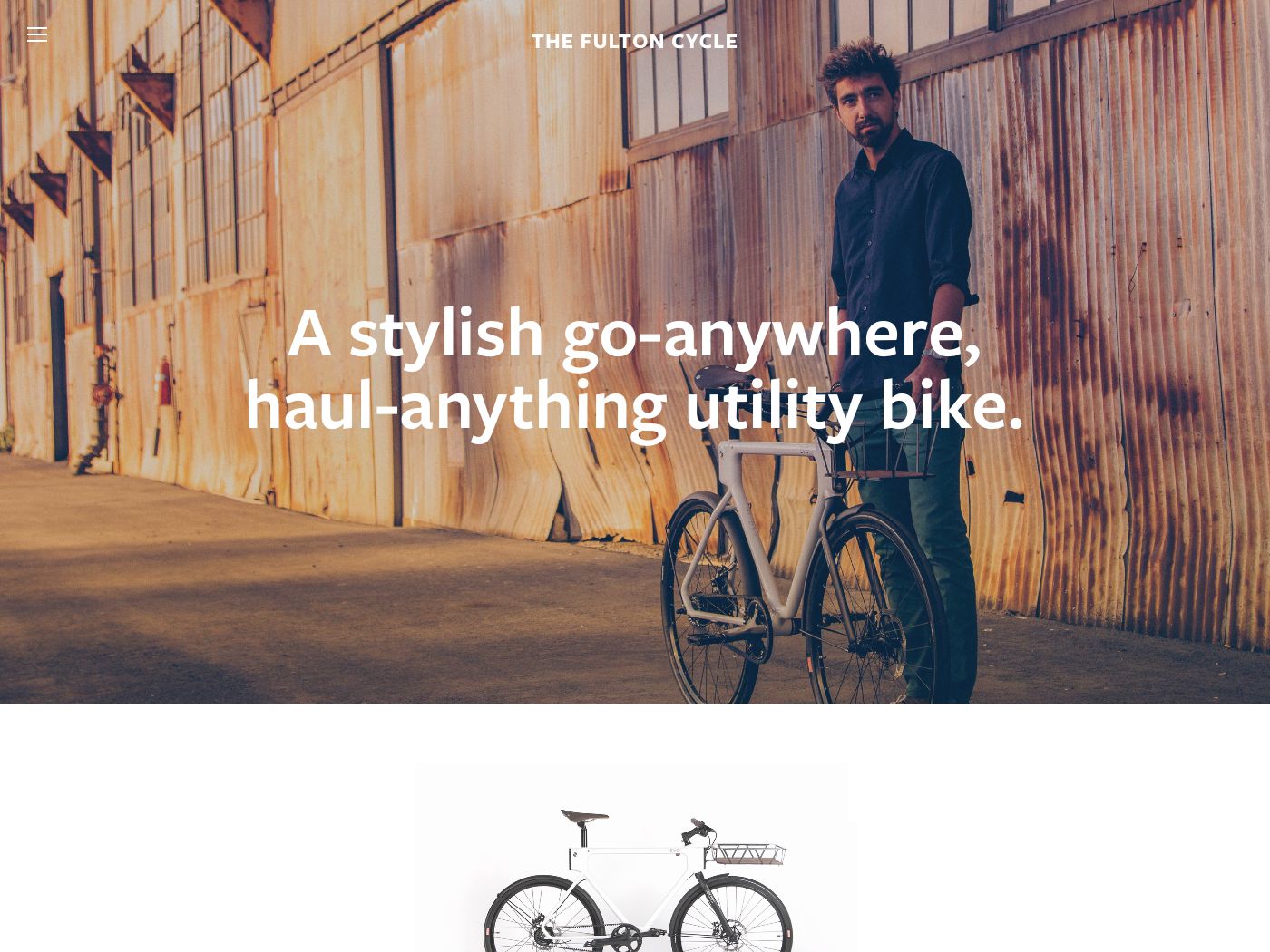
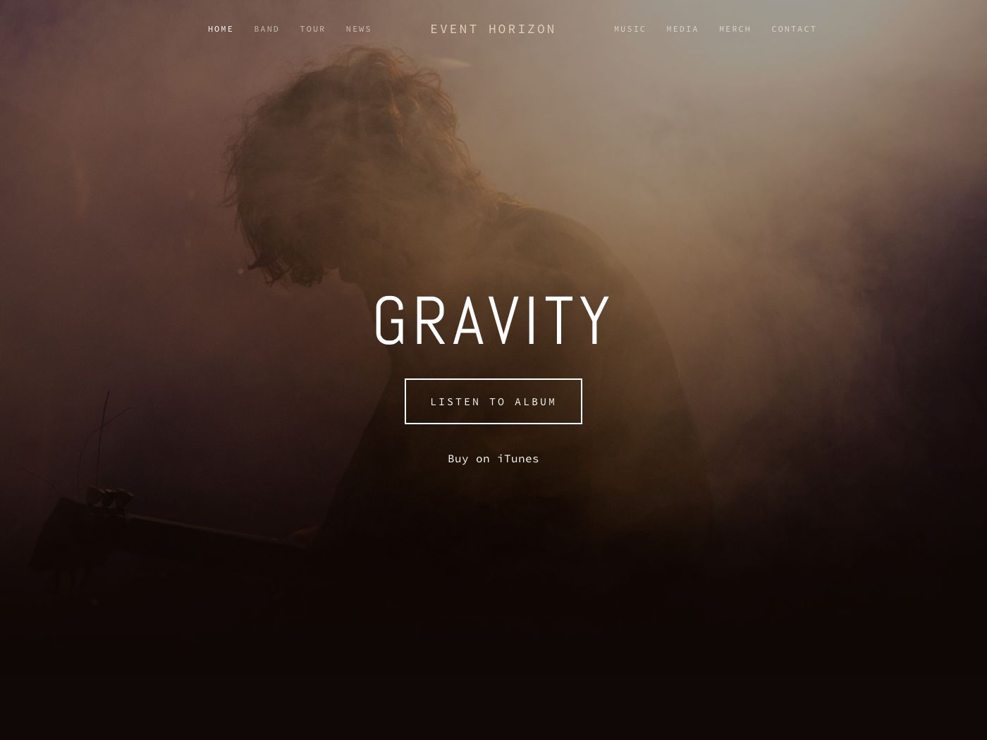
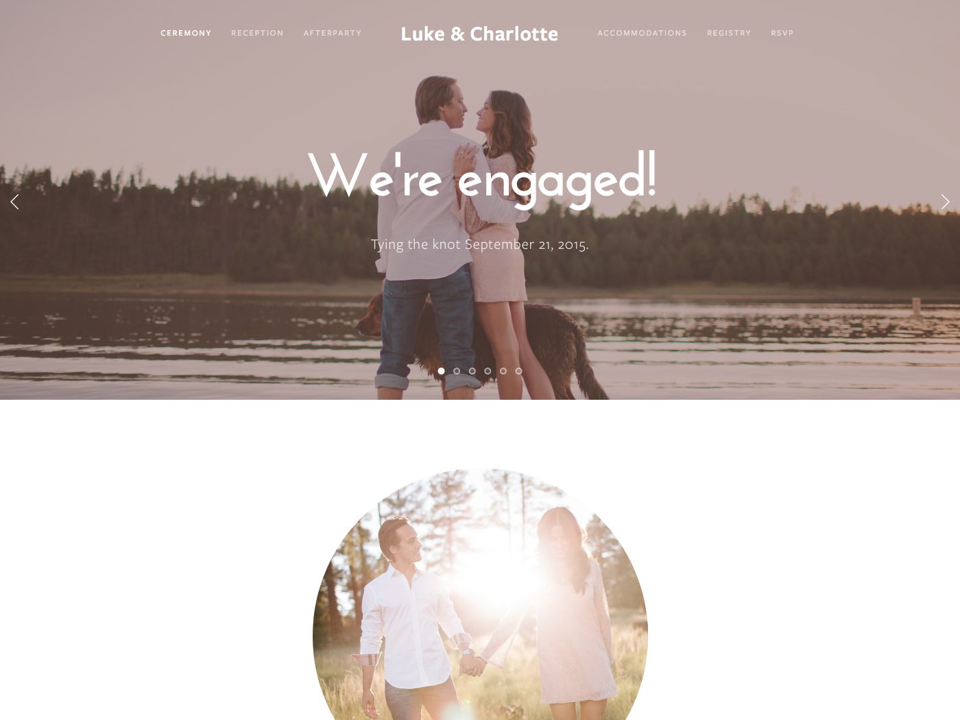
Pacific was first launched with Squarespace 6, and has since proved so popular that Squarespace has developed several clones (or variants) of this template: Bryler (discontinued), Charlotte, Fulton, Horizon, and Naomi. All members of the Pacific family are basically clones, meaning that they have exactly the same set of features/controls as the original template. It seems that the main reason the variants were created was to demonstrate to customers different ways the template could be used for different types of business/website.
Why choose Pacific instead of Charlotte / Fulton / Horizon / Naomi (or vice versa)?
The only reason to choose one of the Pacific variants is because the look and content of that variant’s demo site is more closely aligned to what you want on your site than the Pacific demo site. Since there are no feature differences between any of the Pacific variants, the only benefit would be that you have fewer things to adjust in order to get your site looking like you want.
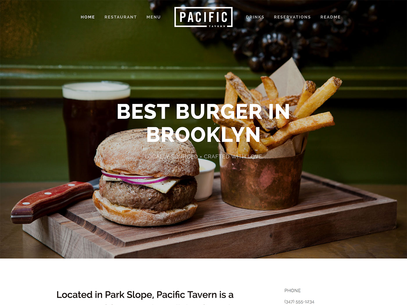
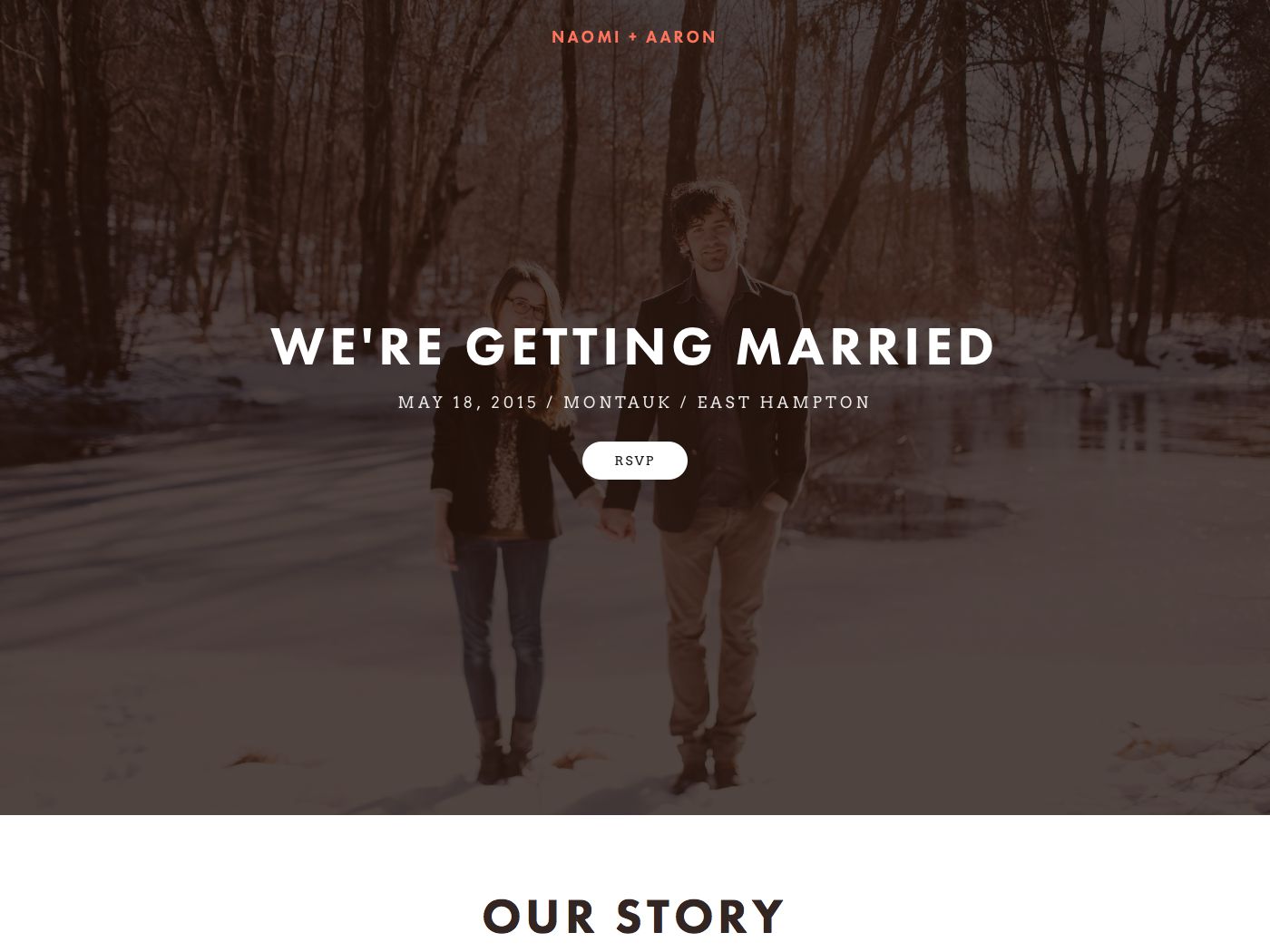
For example, the Pacific demo site is for a restaurant, so it includes a page with an OpenTable Block in it as well as a Menu Block – see the demo site homepage. If your business is also a restaurant, then by starting with Pacific and using that demo page as the basis for your own page, you would have less work to do in setting up that page. If you’re thinking of using Pacific or the others within this family, be sure to check out the different styles and demo site content of each before choosing your final template.
Lastly and most importantly, be sure to read my Squarespace Template Bible for further detail on what templates do and don't control - and how to avoid the single biggest mistake people make when choosing a Squarespace template.
| Strong Point / Best For… | Image-led websites, such as businesses or bloggers who have attractive images and need to segment products or posts into navigable categories. |
| Design Notes | Large, full-bleed header/footer. Medium style controls. |
| Homepage | Standard. Demo uses Index. |
| Index Page | YES, Galleries or Pages, shown as a long scrolling page. If you put a thumbnail image in a page, it displays the page content floating over that image in the background. If using a Gallery, it shows as a full-width slideshow with arrows. |
| Sidebars | NO |
| Header | Large image with floating navbar. Navbar can have logo/title at the center, splitting the navigation in two. |
| Site Tag Line | No |
| Header Images (Banners) | Yes - can be set per page. Can have a translucent tinted overlay colour on top of the images. |
| Main Navigation | Horizontal navbar at top, floating on top of header, with logo in center. Can be collapsed into mini menu icon (like mobile nav, but on desktop). Can be used to jump to different sections within an Index. |
| Fixed Navbar? | YES - but only within Index pages, as you scroll down. |
| Other Navigation | Secondary footer nav. Also Category nav within Products or Blog. |
| Social Icons | None |
| Footer | 2 footers: one with secondary nav, then normal footer. No social icons - you have to set them up manually using a Social Block. |
| Page Titles & Descriptions | YES - but only if banner image is set. Shows floating on banner image. Can hide title but not description (or hide both by not using banner images). |
| Gallery Design | Grid or slideshow, grid default. |
| Gallery Display | Grid shows as tiled mosaic with padding. Clicking item opens lightbox overlay that removes main nav. Image titles and descriptions show on hover on lightbox view. |
| Gallery image title display | Yes, on hover of large image. |
| Gallery image description display | Yes, on hover of large image. |
| Thumbnail image shown in blog Excerpt? | Yes, as large image shown in original aspect ratio (dimensions) above the excerpt text, stretching across full width of the space. |
| Location shown in blog post? | NO |
| Blog Notes | Blog content shows in main centered column, with Categories showing below title. |
| Promoted Blocks? | NO |
| Products Notes | Products show as grid, and display Categories as a secondary nav within the products page. |
| Other Features / Notes | Can make menu into something similar to Adirondack. Creative use of galleries within an Index. If you don't want to use full-width images as Index dividers, you can use horizontal lines instead. |
| Basically identical to… | Charlotte, Fulton, Horizon, and Naomi (these are variants of Pacific) |
| Similar to… | Bedford family, Brine family |
Visit Squarespace and start building your site now. Or, get in touch if you’d like me to help you.