Why does my website look different on your computer?
LAST UPDATED: Oct 2023

AKA Why there’s no such thing as “before the scroll” and other web design myths debunked
Learn how to become a web design Zen Master – and why you need to be one these days!
Here’s a list of some common requests that I get from clients that it’s no longer possible to solve:
Can we make it so the text paragraph aligns with the bottom of the image?
Can we make the line of text break after this word, and not that one?
Can we make this element show before people have to scroll?
OK, then just make it look good for most people’s screen size.
If you’ve ever asked yourself or your web designer any of these questions - or if you’ve ever been surprised at the way your website looks when you see it on your friend/colleague’s computer screen or phone, this post is for you.
Espresso in a latte mug
You might be wondering why there’s a photo of lots of different types of coffee at the top of this page. Aside from fuelling web teams, coffee can be a good way to think about websites. If you go to your cupboard and pull out all the different mugs and cups, unless you’re Marie Kondo, you probably have lots of different shapes and sizes of cups. There’s no universal standard for coffee cup sizes. Computer monitors are much the same - there’s no single standard for the dimensions, number of pixels, or aspect ratio (eg. 16:9 or 4:3). Even if you have the same brand computer as someone else, and even if you have the same model and year, you might have your resolution set differently, or you might have a toolbar or other system setting that takes up a portion of the screen. Or, maybe you prefer to work with multiple application windows open on your computer at the same time, so your web browser window is a different size/shape/number of pixels than someone else sees.

Photo by Marco Verch
And that’s just computer monitors. What about the hundreds of different phone sizes & shapes? And tablets? And internet TVs? We don’t just have cups, now we’re talking bowls and glasses and soup tureens and gravy boats and… you get the idea.
Fluid design
Aside from the different shapes and sizes of containers you might use to hold it, coffee is a good analogy for websites because it’s a liquid. Most websites these days use something called responsive design, which means that the design flexes to fit the type and size of device screen it is displayed on. Much like a liquid takes on the shape and size of the vessel you pour it into, the content on a website will flex to fill the shape and size of the browser window.
Think about the shape of the liquid in a full espresso cup. Now if you pour that same espresso into a big latte mug, it changes shape. The same thing happens to your website content.
You can try this yourself right now. If you’re on a computer, move your mouse over to the right side of your browser and drag the right edge of the browser inwards towards the left. You should see the text on this page flows to fill the space. If you’re on a tablet or mobile, turn the device in your hand to switch from holding your device in vertical/portrait view into horizontal/landscape view and you’ll see the same thing happen.
Designing for different screen sizes and shapes
Back in the days before the internet, newspaper layout designers used to talk about content above/below “the fold” - that is literally the place where the paper was folded. All the hot stories would be put “above the fold” so they could be seen at a glance when the newspaper was stacked at the news stand. Fast forward to the 90s and this concept was carried forward to web design: we would aim to put all the important content above the point when people would need to scroll. It was easy back then, because there were no smartphones, and everyone’s computer monitor showed the same number of pixels.
Today there is no such thing as “above the scroll/fold” when it comes to web design, because the scroll point happens at a near infinite number of places on the page. Here’s the latest breakdown of screen resolutions (pixels wide by pixels tall) for both computers and mobile phones:
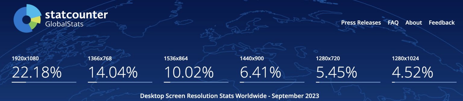
Desktop: Stats from Global Statcounter
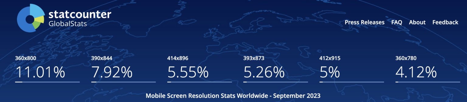
Mobile: Stats from Global Statcounter
You can see that even the so-called most common “desktop” screen resolution (1920x1080) makes up only 22% of the total number of different computer resolutions in use by humans on earth at this time. With mobile phones, “most common” is only 11%. We can’t even design for the most popular size, because that size isn’t really very popular in the grand scheme of things.
Below is a set of images showing the same website as it appears on different screen sizes. The first 3 are all “desktop view” - but notice how different they are.


Even those first 3 different views combined only make up less than half of the possible “desktop views” of your website. And notice how the amount of content you see can be very different, even on two similar devices (iPad 2 and iPad Pro).
Should I design for mobile or desktop first?
At this point, you might be asking whether more people use mobile phones or computer screens to look at websites. I could give you the general stats (here they are if you’re curious), but that would be misleading. The correct question to be asking is whether more people will use mobile phones or computer screens to visit your specific website. The answer will vary dramatically.
On my own website, roughly 85% of my visitors are on computer screens - which makes sense, due to the nature of my business (my customers are probably other businesses or people at work). If you look at the stats for Booking.com or McDonald’s, I guarantee the stats would be dramatically weighted the other way. Many of my B2C and e-commerce clients have 70%+ mobile visitors.
So if you take my website as an example, I can’t even say that statistically 11% of my visitors use the “most common” mobile resolution, because the total number of mobile visitors is only 15% of visits. And if you think I’m going to spend much time moving pixels around to make things look better for whatever 11% of 15% is, well… I think you see where I’m going here.
Zen and the art of letting go
Here’s that same set of questions from the top of the page, and the response to each:
Can we make it so the text paragraph aligns with the bottom of the image? No, because the text flows to a different length on different screens, and we can never know where that is in relation to the image.
Can we make the line of text break after this word, and not that one? No, because the line break happens according to the width of the person’s screen.
Can we make this element show before people have to scroll? Not unless it’s the very top thing on the page, because we can’t tell exactly where the scroll point happens on any given screen.
OK, then just make it look good for most people’s screen size. You have to understand that there is no such thing as a majority anymore. The “majority” most common screen size is less than a quarter of the total.
By the way, more often than not, that last one probably really means: make it look good on my /my boss’s screen. You’d be surprised at how many people design their own websites without checking how it looks on screens other than the ones they have themselves.
I have to say “no” a lot more these days than I used to. It kinda sucks. But it’s kinda liberating.

I now have to teach my clients and trainees the same thing I had to learn myself about 8-9 years ago: that we have to be a bit “Zen” when it comes to web design, and just let some things go. I’m not saying design details aren’t important. But I am saying that there are some details that are no longer within our control, so we must become one with the universe and just accept them (or something like that!).
Many of my clients - especially those who have been in business for a while - are used to the way that print design works: you design the pixel-perfect brochure, and send it to the printer, and what you get back looks pretty much exactly like the digital file you saw when you sent it to the print house. Web design doesn’t - in fact it CAN’T - work that way. The sooner you can become at peace with the idea of letting things go, the happier you will be with your website project.
Your website content is way more important than the design.
In web design today, it’s much better to get things looking 70-80% the way you want it for 70-80% percent of the people, and focus that last 20-30% of your time and energy on making your content that much better. Because at the end of the day, the content on your website is WAY more important than whether 3.4% of the people who visit your site will see an extra word here or have a block of text aligned perfectly with a button. You need to make the site content so compelling that they click that button. Who cares whether it’s 6 pixels lower than you wanted?
If a perfectionist control freak like me can do it, anyone can.