Blog Design & Tech Support
Recently Dave Wieneke, a digital strategist from Boston who has a long-running and very popular business blog called Useful Arts, contacted me looking for some help on improving the look and functionality of his blog. I had originally started working with Dave about 18 months ago, when he got in touch asking for some technical maintenance help. His blog had been running really slow, and he had also lost some data on a previous upgrade, so he wanted someone who knew their way around WordPress to give him a hand. After giving his blog a good spring clean, upgrade and backup, the site was running smoothly and much quicker (you can read Dave's blog post about this - including the great results - here).
Therefore, with everything being ship-shape from a technical perspective, it seemed a good time to reflect on the design and features of the site, especially as Dave had gradually begun to focus more on the strategic side of digital marketing - rather than the legal aspects - in his writing. The existing design and messaging were a few years old, so he wanted to bring things up to date across the board: in terms of branding & messaging, in terms of look & feel, and in terms of the features & functions that the site offered. Dave had a really good idea of what he wanted, so he created his own brief and we started the dialogue through Skype and email. This was really helpful to me, as clients often come with a 'clean slate' and no clear idea of what they need the site to do or say. But this was one time when the design questionnaire I usually send to clients was not really required.
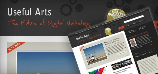
As far as the look of the site, Dave wanted to bring the blog in line visually with his new speaking website DaveWieneke.com, while still imparting its own identity: the sites should be related, but more as 'cousins' rather than 'twins'. Functionally, the site needed to maintain the existing Twitter feed, but should also incorporate/offer:
- Better sign-up options for RSS & email: make these more visible
- More 'personality': give the site a human touch, show the identity of the owner
- Social sharing: the ability for people to bookmark, email or otherwise share links to his articles
- Exposing deep content: the site has thousands of great articles, but they were hidden once they fell off the homepage
- Showcasing the main themes: make it easier to see the topics of the site to encourage further browsing
I used a combination of design layout, coding and plugins to tackle each of the requirements above, as follows:
- RSS & Email sign up buttons appear at the top of each page, with plenty of space around to make them stand out. I also included the WP Greet plugin, which displays a welcome message to new site visitors who arrive from Google or other search clickthroughs, encouraging them to sign up to receive updates.
- "About" content appears in the sidebar with a photo of Dave, as well as in its own page in the main page navigation. Each author on the blog also has a biog page, which you can view at any time by clicking on the author's name. The use of handwriting fonts also bring a 'human touch' to the design.
- I used the number one bookmark plugin, Sexy Bookmarks, to add stylish social sharing buttons on each post page. The Twitter feed has also been brought to the forefront, and additional social links are in the large footer area at the bottom of each page.
- The site has a prominent "Featured" box at the top of the homepage, and a "You may also like…" box at the end of each article which shows related posts.
- We've used a strapline under the site logo to encapsulate the main theme of the blog, as well as a new 'Topics' navigation menu that Dave can fill with whichever article categories he wishes. He can also re-order and rename topics easily without affecting the underlying WordPress structure, meaning it's possible for him to reuse existing categories - as well as create new ones as the blog grows or evolves over time.
The overall design uses elements from DaveWieneke.com, such as colours, fonts and other concepts - such as large colour blocks - but I think it maintains its own identity and works well as a standalone.