Wexley Squarespace Template Analysis
Helpful notes on the distinctive features of the Wexley template
Updated March 2018
Template Name: Wexley
Wexley was one of the first templates that was released when Squarespace 6 first launched, way back in 2012, which means Wexley is one of the oldest templates still available on Squarespace 7 today.
Why choose Wexley?
Websites have changed a lot since 2012, especially when it comes to designing with mobiles and tablets in mind. Although the Wexley template is fully responsive (meaning it flexes to work on all sizes of device), certain things have moved on, and the newer templates have been created with everything from huge HD screens and mobiles in mind from Day 1. This means Wexley feels a little behind the times, especially when it comes to the amount of elements you can control style-wise - it has one of the smallest sets of design controls of all templates. However, it's still a decent choice for creative portfolios, especially if you don't have a lot of time (or desire) to tweak lots of elements design-wise.
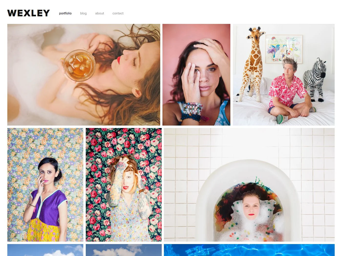
The (then) novel design approach of a "mosaic grid" of photos is not so novel now, and you can actually achieve a similar effect using other templates (or gallery blocks), now. Therefore, I'd only recommend Wexley if you are happy with the positioning of elements and the way the demo site looks on all devices, and you want to quickly and easily slot your content into that framework.
Final tip: be sure to read my Squarespace Template Bible for further detail on what templates do and don't control - and how to avoid the single biggest mistake people make when choosing a Squarespace template.
| Strong Point / Best For… | Creative professionals who want an easy site that showcases images in a tiled mosaic grid. |
| Design Notes | Full-bleed canvas with minimal design elements. Few style controls. |
| Homepage | Standard. Demo uses Gallery. |
| Index Page | NO |
| Sidebars | 1 sidebar, blog only. Choose left, right or hidden. |
| Header | Minimal header: just logo, tagline and navigation. No visual separator from canvas. |
| Header Images (Banners) | NONE |
| Main Navigation | Main horizontal nav at top, left, right or centered with logo. |
| Fixed Navbar? | NO |
| Other Navigation | NONE |
| Social Icons | Bottom footer below footer content, or hidden. Change icon color, size, and style. |
| Footer | Standard, no visual separator or style controls. |
| Page Titles & Descriptions | NO |
| Gallery Design | Grid AND slideshow, grid default. |
| Gallery Display | Grid shows as tiled mosaic with padding. Clicking item opens "overlay" that removes main nav, and has internal gallery nav below image. Image titles (not descriptions) show on grid hover only. |
| Blog Notes | Full text of blog posts show in blog home. |
| Promoted Blocks? | YES |
| Products Notes | |
| Other Features / Notes | |
| Similar to… | Avenue, Flatiron |
Visit Squarespace and start building your site now. Or, get in touch if you’d like me to help you.